Brief evaluation

Unit X

Overall i've enjoy working as a group/ design team i found it enjoyable and productive to work as part of a team discussing ideas and reaching a shared goal; it had a lot more of a job/work place oriented feel to it which was nice, the opportunity to work individually as well as collaborate with other artists of different fields and skills towards a shared goal; though communication has sometimes been an issue everything turned out successful and i got a good experience from it. I personally enjoyed the brief because it was quite vague to begin with we had to find our own direction until we became a team. The final product looks great in my opinion and i'd like to do more of this in the future but maybe with more time to experiment with time consuming processes. 


The vintage dead.

I changed to the idea of zombies, because i like the idea of referring to a subculture as mindless fashion zombies in a tongue and cheek sense Pen/ink hipster corpses and a mini money decorated as there leader next to a star bucks cup (because hipsters love Starbucks) I gave the logo glasses and changed the hair into tentacles so it still has an other worldly feel to it. 

They came from the heavens above.

A collection of old school style horror poster with scifi as well.. I've decided to follow this up as a direction for the hipster element
I love the bold text and blocky colour and they opaque texture of vintage traditional print poster can't be beaten in my opinion.


Aliens seems an interesting choice, i like the idea of an invasion where a subculture comes from beyond the stars.

Rough drama scene sketch of the nq under
 by hipster aliens. Destroying the city and transforming the people into mindless vintage zombies. 

The myan calendar is so vintage it's retro.

The image was copied and pasted cut and arranged in photoshop before flattening. 
Some pages from my NQ zine i collected from the coffee shop in the nq square. Reminded me of the myan calendar depicting the end of the world (apparently) i thought this was awkwardly fitting for my hipster apocalypse.

Rough sketches of thumbnail hipster and my notes of the calendar wheel.
After selective two designs i like i imported them into illustrated and used the live trace tool then fiddled about until i was happy with the line work.


Two complete hipsters..


Dirt wizard of the NQ

I am all that you see, i am all that you want me to be.

This is a poster illustration for the zine inspired by various stoner rock fittingly; the narrative depicts a hobo gang leader who smokes a crack pipe through a human skull and believes he become and all seeing all powerful being.. when really.. he is just high.
'Pen + ink psychedelic'

Bad trip.

generally stoner art and art nouveau post art nouveau etc is associated with happiness and colour and vibrance, but these prints take the style and apply it to a dark negative aspect, like a bad trip or horrific hallucination.
Rough sketches of my stoner landscape, fantasy impressionist trying to see through the characters eyes, naturally i went with a more negative aspect which i find generally more interesting. This bad lsp induced nightmare consists of a flying drunken black bird with a human head (angel) inspired by the owl off jason and the argonaughts and to building trying to devour each other as they melt and a dictator or preacher in the street with a following of zombies (paranoid) and my personal favourite flying eyeball sperm cells. 'pushing the boat out'

Hardly Nouveau

Art nouveau is a decretive art movement original started in france in the late eighteen hundreds, commonly known for it's bright warm colours predominately earthy tones and golds, subject matter consisting mostly of women and flowers with some form of crest or decretive framing element. It has since been copied and bastardised to wear its only recognisable traits are its large amount of negative space and solid tone with minor hints at traditional layout.

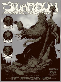
Arik roper, stone rock/doom


Traditionally stoner rock like lots of other music creates its own fashion and stylistic visuals the stone doom drew influence greatly for art nouveau eve thought the resemblance isn't all that clear anymore over time and practice though font manipulation and change in subject matter it has its own style of art, arik roper is one of the more famous illustrators in this genre painting in ink, water colours and loose materials with harsh black inks heavy contrast and intense vibrant colour to represent the feeling of drug induced euphoria. Commonly usuing fantasy landscapes focusing on the natural world, mushrooms, branches mountains water falls. and with barbarian/wizard esque figures at the centre with drastic fonts some times barely legible. Bands in this genre; sleep, high on fire saint vitus and electric wizard.

A collection of posters inspired by art nouveau and stoner/doom bearing psychedelic font, predominately screen prints or digital representation of screen printing.